BOR, this is for you

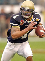
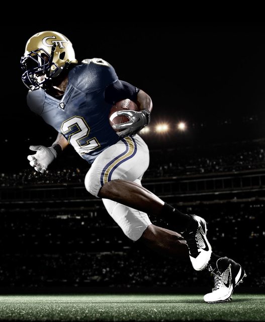
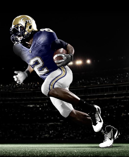
Let's be honest. The reason the pic/uniform looks good is because the player is running in a wide open field. That's cheating (and the gold on the stripe is just a little off). :)

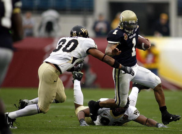
p.s. Looks good to me, although I do prefer the old gold pants, white top, gold helmet as the primary.
 
image_7166765.jpg


^ Based on this, Russell may recycle this and have an "unfinished prototype" available for us in 2017.
 
Like the "no stripe" jersey. Implies "serious work clothes" not "pretty clothes" like the Bear called Bama's.

Get rid of the "candy shoulder stripes" from the recent few years.

The GT on the helmet and the three stripes on the pants trims everything fine. This could be our updated tradition with White over Old Gold for the alternate.

Vegas Gold - don't need it - don't want it - couldn't afford it if I did...
 
I used PMS 539. So, right shade of blue.
color-swatches.jpg
This is for the Institute, not the AA, right? My understanding is that the AA can choose to use different shades if they want.

I hate the blue jerseys (they're ----ing cursed), but if I like the start of this. I'd change the socks to white, get the gold closer to old gold and add an arm stripe to the undershirt. Other than that, good work.
 
Give me white socks and I could go for this over the crap we wear now.Cant belive five uniform changes in.......five years and they all suck.

Yeah but they were all just crappy variations on the same crappy design.
 
I hate the blue jerseys (they're ----ing cursed), but if I like the start of this. I'd change the socks to white, get the gold closer to old gold and add an arm stripe to the undershirt. Other than that, good work.

m-8194.jpg
 
Back
Top