You are using an out of date browser. It may not display this or other websites correctly.
You should upgrade or use an alternative browser.
You should upgrade or use an alternative browser.
New Font for player's names on jerseys?
- Thread starter GoGATech
- Start date
FullMetalBuzz
Posting from your mom’s house
- Joined
- Aug 15, 2014
- Messages
- 221
Interesting catch. It looks like a plain sans serif font instead of the traditional “collegiate” style with hard angled serifs. It should be easier to read on TV but might be harder if you’re in the upper deck straining to see it.
GTballer21
Varsity Lurker
- Joined
- Sep 4, 2008
- Messages
- 487
I’ve been saying the font looked weird all year. Same with any jersey with the #4 on it. The 4 looks lopsided or something on these jerseys.
Edit: Just an example... The #4 on every jersey looks lopsided.

Edit: Just an example... The #4 on every jersey looks lopsided.
Last edited:
NikeJacket
wears adidas now
- Joined
- Oct 28, 2013
- Messages
- 23
Like it. It's the classic Name plate block used for a vast majority of teams.
The main issue this year besides the font was how the name plate was sewn and applied (stretched letters)
Can see it in the original press release:

However, this just looks photo shopped on the jersey:

The main issue this year besides the font was how the name plate was sewn and applied (stretched letters)
Can see it in the original press release:
However, this just looks photo shopped on the jersey:
FullMetalBuzz
Posting from your mom’s house
- Joined
- Aug 15, 2014
- Messages
- 221
I’ve been saying the font looked weird all year. Same with any jersey with the #4 on it. The 4 looks lopsided or something on these jerseys.
The numbers this year used a different font as well, but it is closer to the traditional collegiate serif with some weird asymmetric top heavy font.
The player names are a completely different font family.
I’m not a fan of either, but if this is the price for Adidas cool then so be it.
vapspwi
Dodd-Like
- Joined
- Oct 18, 2002
- Messages
- 8,080
I don't mind the numbers (didn't notice the weird 4s) but didn't love the look of the name font in person or on TV - it looks kind of cheap and labelmakerish.
While we're nitipicking fonts, can anybody tell me why in the heck most of the 5s on our scoreboard (besides the clocks, I think) are upside down 2s? (I've even noticed this in some e-mail graphics, so I wonder if we've just got a font with stupid 5s.)
Edit: Here's an example. That's not a 5!

JRjr
While we're nitipicking fonts, can anybody tell me why in the heck most of the 5s on our scoreboard (besides the clocks, I think) are upside down 2s? (I've even noticed this in some e-mail graphics, so I wonder if we've just got a font with stupid 5s.)
Edit: Here's an example. That's not a 5!
JRjr
Last edited:
VolJacket
Varsity Lurker
- Joined
- Dec 8, 2018
- Messages
- 81
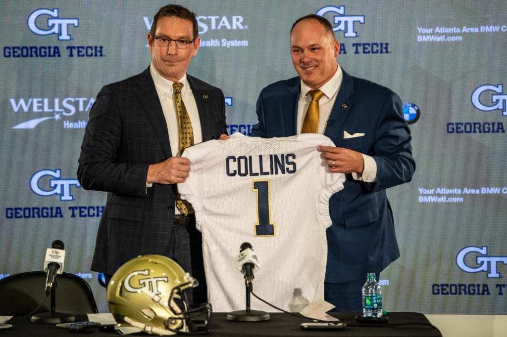
Haven't seen this talked about anywhere, but I've noticed this on the jersey presented to CGC and on all the pics I saw of recruits over the weekend. I like this look much better:
I like that

GoGATech
Big Dummy
- Joined
- Aug 26, 2008
- Messages
- 11,824
Good catch on the photoshop. I didn't look that hard at first but they're definitely shopped. Wonder why they would choose to use this different font on CGC's jersey and for the photoshop recruit pics though if we're staying with the other? Maybe we'll get this one next year.Like it. It's the classic Name plate block used for a vast majority of teams.
The main issue this year besides the font was how the name plate was sewn and applied (stretched letters)
Can see it in the original press release:
However, this just looks photo shopped on the jersey:
EastboundJacket
Damn Good Rat
- Joined
- Nov 27, 2013
- Messages
- 1,233
I wouldn't put too much stock into either of these. The Collins jersey would've been printed in a hurry and looks like just a plain white jersey with no piping, and the font on the photoshopped recruit pics wouldn't have much to do with the actual font we use.
coit
Persecuted for his beliefs
- Joined
- Nov 29, 2007
- Messages
- 88,461
NikeJacket already pointed that out.
edit: coit bitched out on his repost
Haha, I deleted it like 30 seconds after I posted. I overlooked him mentioning the photoshop in between the pictures.
GoGATech
Big Dummy
- Joined
- Aug 26, 2008
- Messages
- 11,824
That's sort of my point though. If you're gonna photoshop it, you can use any font you want. So why not use the font we actually use?I wouldn't put too much stock into either of these. The Collins jersey would've been printed in a hurry and looks like just a plain white jersey with no piping, and the font on the photoshopped recruit pics wouldn't have much to do with the actual font we use.
TheSteamWhistle
Varsity Lurker
- Joined
- Dec 31, 2014
- Messages
- 43
The font on the recruits jerseys are photoshopped.
Architorture23
If ur players know u luv them, then u already won.
- Joined
- Jan 28, 2011
- Messages
- 28,975
The intern doing the 'shopping doesn't have the font installed on his temp work station.That's sort of my point though. If you're gonna photoshop it, you can use any font you want. So why not use the font we actually use?
Share: