At least we aren’t the only ones to fight over branding issues

The only thing you can really do on the GT logo is extend the length of the T, or the width of the G, but that would look closer to the uga logo so that’s a no go. The T scenario happened with the previous license plates, hard to notice unless you’re really looking for it. Still, can’t imagine arguing much about it.

“hey öööö you and you tall T supporting bastard”.

Doesn’t have the same ring to it as , “what kind of moron likes Vegas gold”, or “we change uniforms too often, look at all the classic teams that never change uniforms, I hate change and new things, get off my lawn”.
 
Last edited:
Someone on Stingtalk pointed out previously that the "T" isn't symmetrical in our logo, which I had never noticed or thought about before. So I'm here to share that gift with anyone here who was living in blissful ignorance. Hope you're not too OCD.
 
They should modify the GT so that the vertical lines on the G and T connect.
 
Someone on Stingtalk pointed out previously that the "T" isn't symmetrical in our logo, which I had never noticed or thought about before. So I'm here to share that gift with anyone here who was living in blissful ignorance. Hope you're not too OCD.
D@MN YOU!!!!
 
Someone on Stingtalk pointed out previously that the "T" isn't symmetrical in our logo, which I had never noticed or thought about before. So I'm here to share that gift with anyone here who was living in blissful ignorance. Hope you're not too OCD.
The serifs on the G are also significantly different. I was told once that the G was actually a rotated omega, but that is not the case.
 
Lol at everyone saying "don't mess with the GT" when it comes to visual identity and branding, compared with how tightly most schools (like Auburn) guard the smallest details.

Our GT has like 8 million versions. Long T, short T, wide serifs, rounded serifs, slanty serifs, stretched, fat, round, wide in the middle, disproportional cross T, thick border, no border, thin border, GT with dual borders, midfield GT, narrow GT, helmet GT, round GT (thankfully retired in the 90s but I'm sure it will come back someday). That's completely leaving out all the color ridiculousness.

I'm not saying it's worth complaining or bitching about or making it a priority, but nobody does visual brand and logo management worse than GT.

Oh look, "Mr. Wrong Shade of Gold" has diversified his whining into fonts now as well.
 
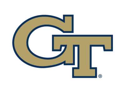
The GTAA has done a good job of scrubbing all of the variations of the GT logo from search engines since the rebrand. Google "Georgia Tech logo" and you'll really only see this, though in a few various color combinations.

Georgia-Tech-Logo-400x300.png
 
The GTAA has done a good job of scrubbing all of the variations of the GT logo from search engines since the rebrand. Google "Georgia Tech logo" and you'll really only see this, though in a few various color combinations.

Georgia-Tech-Logo-400x300.png
Does the shade of blue on the border look off to anyone else?
 
The GTAA has done a good job of scrubbing all of the variations of the GT logo from search engines since the rebrand. Google "Georgia Tech logo" and you'll really only see this, though in a few various color combinations.

Georgia-Tech-Logo-400x300.png
If you look closely you’ll see the T is perfectly symmetrical.
 
Lol at everyone saying "don't mess with the GT" when it comes to visual identity and branding, compared with how tightly most schools (like Auburn) guard the smallest details.

Our GT has like 8 million versions. Long T, short T, wide serifs, rounded serifs, slanty serifs, stretched, fat, round, wide in the middle, disproportional cross T, thick border, no border, thin border, GT with dual borders, midfield GT, narrow GT, helmet GT, round GT (thankfully retired in the 90s but I'm sure it will come back someday). That's completely leaving out all the color ridiculousness.

I'm not saying it's worth complaining or bitching about or making it a priority, but nobody does visual brand and logo management worse than GT.
There is only one GT. There are a boatload of UA/AUs. You see ANY interlocking GT we have ever used and you think Georgia Tech. Auburn has to try to differentiate from a lot of schools with the same letters, which is why they are stuck with that logo or something insanely close for better or worse.
 
Back
Top