smokey_wasp
Dodd-Like
- Joined
- Nov 25, 2013
- Messages
- 11,645
Turrible.
Follow along with the video below to see how to install our site as a web app on your home screen.
Note: This feature may not be available in some browsers.
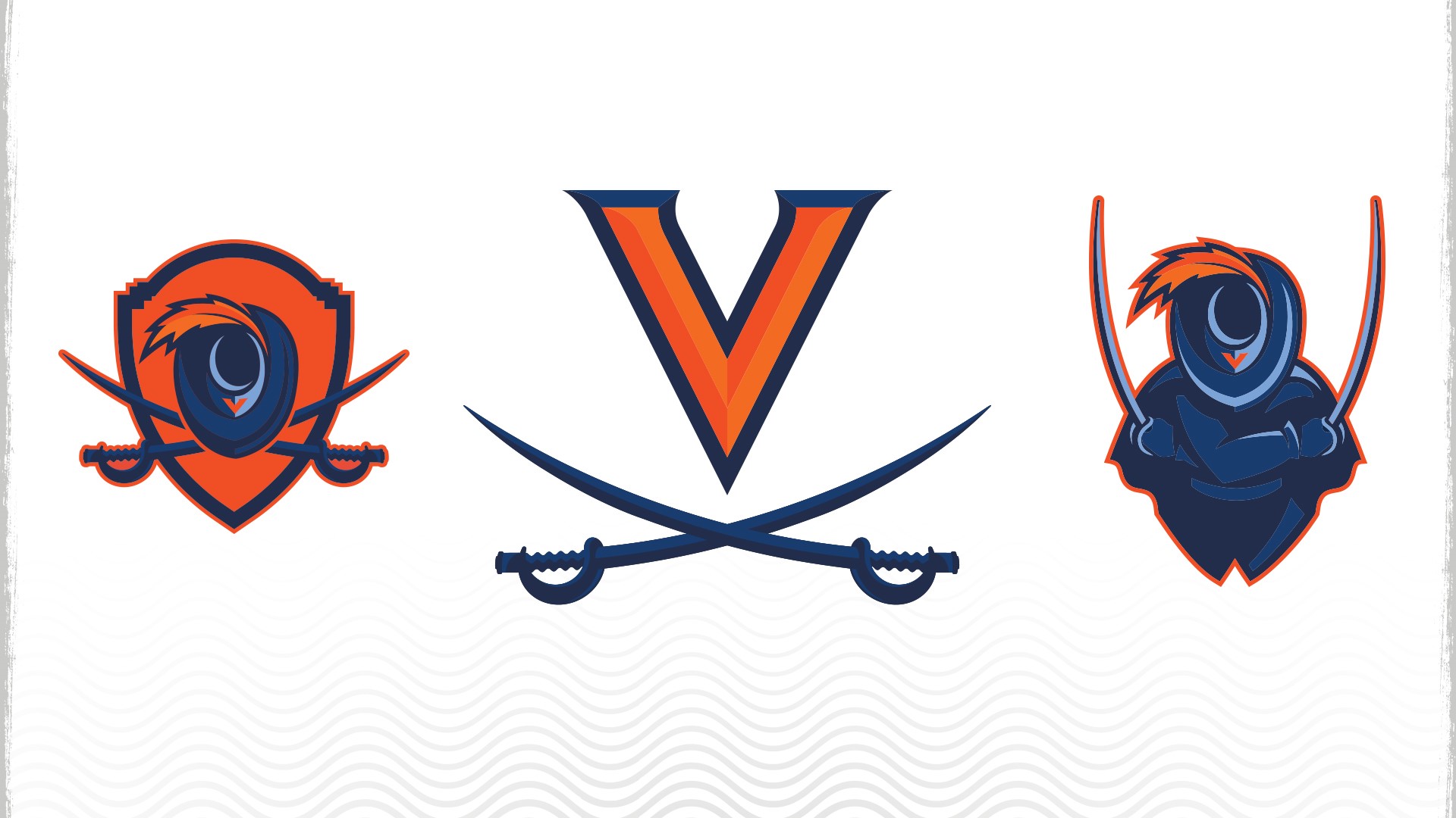
Change for change's sake.Why would they ever move from the V with the crossed sabres? That’s a top 10 college logo with us, ND, Auburn and UNC
Why would they ever move from the V with the crossed sabres? That’s a top 10 college logo with us, ND, Auburn and UNC
The one on the left looks more like the product of a taxidermist than a sports logo.They didn't move away from it. They just refined it and then added the other two. Kind of redundant imo, kind of like when we had like six different buzz logos

Middle one is nice – better than the old V with sabres.They didn't move away from it. They just refined it and then added the other two. Kind of redundant imo, kind of like when we had like six different buzz logos

