You are using an out of date browser. It may not display this or other websites correctly.
You should upgrade or use an alternative browser.
You should upgrade or use an alternative browser.
Some of y'all won't like this.
- Thread starter BranMart
- Start date
texstinger
Dodd-Like
- Joined
- Jul 12, 2002
- Messages
- 8,816
FWIW, those that didn't like the navy and said we looked like Pitt... well not anymore:
Those truly are the Pitt unis of greatness. Smart move.
They really must have had a stupid AD that made them get rid of the Pitt script logo and go to navy blue & gold instead of this uni.
GoGATech
Big Dummy
- Joined
- Aug 26, 2008
- Messages
- 11,827
Not a fan. Rather the Gold with white trim like the winter white b-ball uniform
I retract my previous statement. I edited it to this and I think it would work:I really like the look but I have to say I think you're right about this.
BuzzLaw
StinGTalk destroyer
- Joined
- Nov 24, 2008
- Messages
- 11,916
FWIW, those that didn't like the navy and said we looked like Pitt... well not anymore:
Thank God I didn’t go to Pitt
Yukonwreck
Dodd-Like
- Joined
- Sep 27, 2007
- Messages
- 6,599
FWIW, those that didn't like the navy and said we looked like Pitt... well not anymore:
Resembles a nittany lion.
- Joined
- Jul 24, 2002
- Messages
- 10,685
I retract my previous statement. I edited it to this and I think it would work:

Yassss... that's the look for white out
Don’t know that you would be able to see it.Yassss... that's the look for white out
- Joined
- Jul 24, 2002
- Messages
- 10,685
Don’t know that you would be able to see it.
All that matters is that you're able to see it in crystal clear color in 1080p.
Not worried about my view of the logo from the upper North.
GoGATech
Big Dummy
- Joined
- Aug 26, 2008
- Messages
- 11,827

JJacket
Declared dead for tax purposes.
- Joined
- May 20, 2003
- Messages
- 87,428
The uni's would look awfully good scoring touchdownsAll that matters is that you're able to see it in crystal clear color in 1080p.
Not worried about my view of the logo from the upper North.
GTballer21
Varsity Lurker
- Joined
- Sep 4, 2008
- Messages
- 487
This with white or gold facemask FTWI retract my previous statement. I edited it to this and I think it would work:
ibeeballin
Dodd-Like
- Joined
- Jan 10, 2010
- Messages
- 10,843
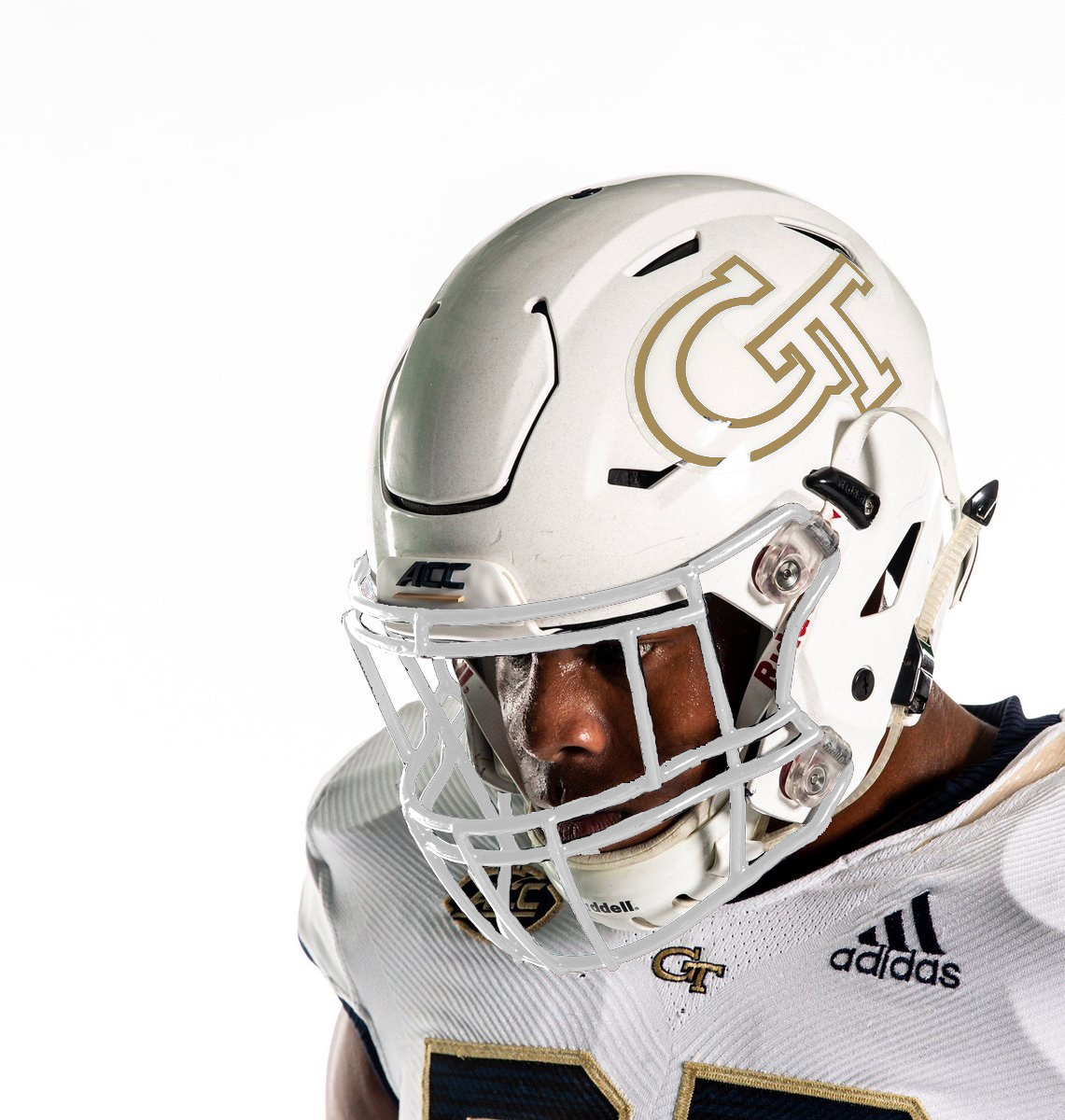
This with white or gold facemask FTW
White facemask
GoGATech
Big Dummy
- Joined
- Aug 26, 2008
- Messages
- 11,827
I agree. If we gonna ice it out go white facemask, and use the white jerseys with gold numbers. Go minimal on the navy for whiteout.White facemask
Edit: My edit skills arent good enough to make that facemask white. Maybe @Wreck Em or somebody else can do that.
Allen Koholic
Likes dick drawings.
- Joined
- Dec 10, 2007
- Messages
- 25,776
I'd much prefer this, even if the shade of gold needs to be tweeked. It's more on-brand to include the old gold.I retract my previous statement. I edited it to this and I think it would work:
I'd like to see the colored top we're going to eventually need to wear when some asshole school cock-blocks the white jersey. But I love that it's clear we're going whites as much as possible.
What's with the Pitt helmet/pants stripe? Is it supposed to be a öööö weld?
Architorture23
If ur players know u luv them, then u already won.
- Joined
- Jan 28, 2011
- Messages
- 28,980
BranMart
Vegetables taste like sad.
- Joined
- Nov 15, 2006
- Messages
- 3,819
It is an interior view of their Cathedral of learning.What's with the Pitt helmet/pants stripe? Is it supposed to be a öööö weld?
GT65_UGA89
We’re a Coca-Cola school
- Joined
- Nov 18, 2005
- Messages
- 12,009
I’m a traditionalist in many aspects of life -and that includes the GT traditional uniform. However, if there was ever a time to mix things up and try something new from an aesthetic perspective, it’s now.
I’m all in.
I’m all in.
ClubSeats
Well-meaning elderly man with a poor memory
- Joined
- Jan 24, 2019
- Messages
- 5,557
LA Rams BlueLol at their rebranding with whatever you call that shade of blue.
Share: