GEETEELEE
Dodd-Like
- Joined
- Jul 8, 2002
- Messages
- 40,298
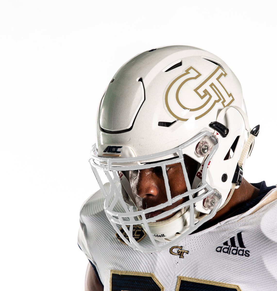
Nah. I like the minimalist simple black outline...except that should not be black, but navy blue, as well as the numbers on the jersey. Maybe it is, but looks black in the photograph/computer screen.More contrast here but still has the gold, and incorporates white lettering for the "whiteout."