gtfan1147
Dodd-Like
- Joined
- Dec 8, 2001
- Messages
- 4,857
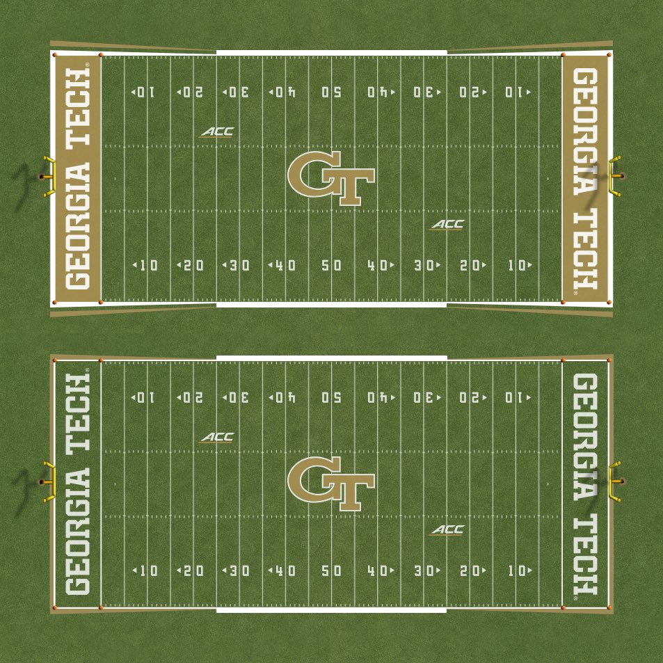
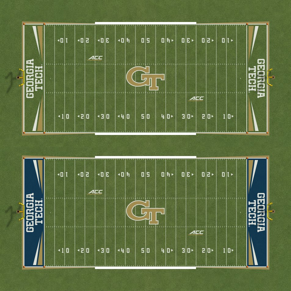
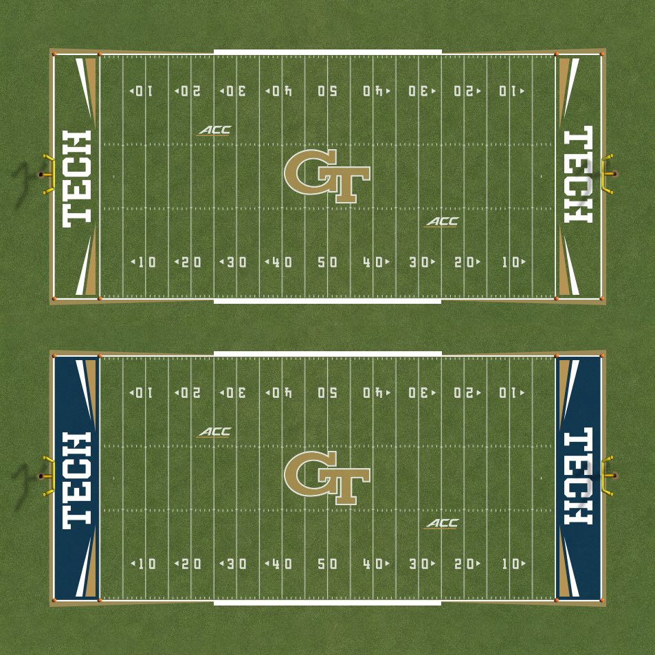
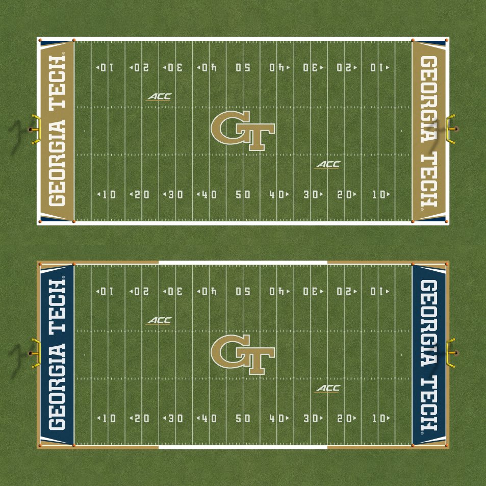
The first one with the gold background is the no-brainer end zone, IMO. Nothing personal, but I think the stinger stripes would look awful because it would require the block letters to be tiny and stacked on top of each other.My mind of course went right to field design. I hope we can lose the drop shadow on the wordmark in the end zone and maybe use the stinger shapes from the uniforms in some way.


 Pray for rain.