Install the app
How to install the app on iOS
Follow along with the video below to see how to install our site as a web app on your home screen.
Note: This feature may not be available in some browsers.
You are using an out of date browser. It may not display this or other websites correctly.
You should upgrade or use an alternative browser.
You should upgrade or use an alternative browser.
New Helmet!
- Thread starter GruffyMcGuiness
- Start date
Allen Koholic
Likes dick drawings.
- Joined
- Dec 10, 2007
- Messages
- 25,795
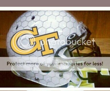
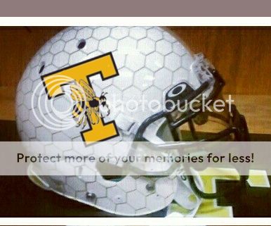
I wanted to see how they'd look with logos. I thought the T would look better (I did some simplifying of it, now it looks like a Texas Tech helmet). I guess the GT is really the way to go, in terms of presenting something that is retains our brand identity.
Allen Koholic
Likes dick drawings.
- Joined
- Dec 10, 2007
- Messages
- 25,795
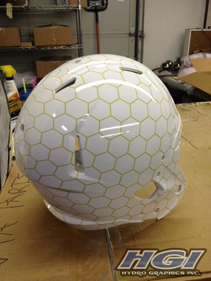
I hope the lines aren't gold like that. That design I absolutely hate. The honeycomb will only work if it's subtle enough not to notice at a distance. That gold looks atrocious.Also, it looks like this company may have been responsible, and though you can't tell in Synjyn's picture, the lines may be gold.
GTechNick
Damn Good Rat
- Joined
- Oct 23, 2009
- Messages
- 1,030
I wanted to see how they'd look with logos. I thought the T would look better (I did some simplifying of it, now it looks like a Texas Tech helmet). I guess the GT is really the way to go, in terms of presenting something that is retains our brand identity.
The GT is pretty Bad-A.
THWUGA
Dodd-Like except wouldn't have left the SEC
- Joined
- Jan 26, 2003
- Messages
- 3,992

Nice. HX Tours? Where can I get a box?
cajunjacket
Dodd-Like
- Joined
- Dec 5, 2007
- Messages
- 11,698
Also, this is a pic from the basketball stadium. I'm guessing the honeycomb design is the new thing for GT athletics?
I'm liking the new hexagonal trend. Reminds me of skeletal formulas in chemistry.
Pantone4515
Damn Good Rat
- Joined
- Dec 22, 2007
- Messages
- 1,384
So are we fairly certain these will only be a ONE-time deal? Now that I've seen them, I wouldn't mind them being our permanent helmets, if the finished product looks good and the players like 'em.
There's no way they're our regular helmets. These will be occasional at most. Our helmets will be gold.
LambdaChiGT
Dodd-Like
- Joined
- Sep 12, 2008
- Messages
- 4,707
I wanted to see how they'd look with logos. I thought the T would look better (I did some simplifying of it, now it looks like a Texas Tech helmet). I guess the GT is really the way to go, in terms of presenting something that is retains our brand identity.
ok, theyre growing on me a little bit. i agree that they remind me of what nike has been doing with the procombat uni helmets (florida had the light gatorskin, tcu had horned frog skin? etc) and as long as it is faint and not overpoweringly obvious it is kind of cool.
ken is just reporting what he is told. i'm sure the aa wants to keep everything a surprise. the fact that days had to take his pic down supports that, as does that article leaked earlier in the offseason that said we would come out in our old unis for warmups then change for the game.
i'm not huge on using the honey/hexacomb pattern across the board. it is a little cheesy to me. i hated when the baseball dugouts got covered with it a few years ago. hopefully the jerseys don't incorporate it. the helmet is enough.
Nashville Jacket
Dodd-Like
- Joined
- Jul 20, 2009
- Messages
- 7,818
I hope the lines aren't gold like that. That design I absolutely hate. The honeycomb will only work if it's subtle enough not to notice at a distance. That gold looks atrocious.
That was obviously a work in progress helmet, so I wouldn't judge an unfinished product.
Nashville Jacket
Dodd-Like
- Joined
- Jul 20, 2009
- Messages
- 7,818
ok, theyre growing on me a little bit. i agree that they remind me of what nike has been doing with the procombat uni helmets (florida had the light gatorskin, tcu had horned frog skin? etc) and as long as it is faint and not overpoweringly obvious it is kind of cool.
ken is just reporting what he is told. i'm sure the aa wants to keep everything a surprise. the fact that days had to take his pic down supports that, as does that article leaked earlier in the offseason that said we would come out in our old unis for warmups then change for the game.
i'm not huge on using the honey/hexacomb pattern across the board. it is a little cheesy to me. i hated when the baseball dugouts got covered with it a few years ago. hopefully the jerseys don't incorporate it. the helmet is enough.
I think to make it look right you have incorporate the comb into the pants or shirts. It can be as simple as something like a stripe on the pants or portion of the jersey.
Nashville Jacket
Dodd-Like
- Joined
- Jul 20, 2009
- Messages
- 7,818
- Joined
- Jun 9, 2010
- Messages
- 34,371
ciegetanks
Damn Good Rat
- Joined
- Sep 15, 2011
- Messages
- 1,386
Idea: hexacomb facemasks
That might be kind of cool.
QuadF
Dodd-Like
- Joined
- May 23, 2011
- Messages
- 11,886
something along these lines (bottom row) would have been cool:

i like how the 2nd one is actually a yellow jacket head, even if it is far too obnoxious.
#1stinga6
Dodd-Like
- Joined
- Feb 20, 2008
- Messages
- 3,027
:turbonoes:
Share: