Uniform vs UNC

Why are we wearing blue while playing against one of our 3 blue

2-0 actually
My guess is that in College the Visiting Team gets to choose what to wear

Since UNC chose all White that kinda forced our hand into wearing something the 'Croots will luv

Unless we wear the Mustard, Carson-Era throwbacks, then Gold vs the other Team in White doesn't create enough contrast IMO
 
5c243a1e7b3e6.image.jpg


FAAAsEFVcAEHOKG
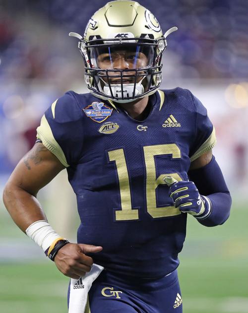
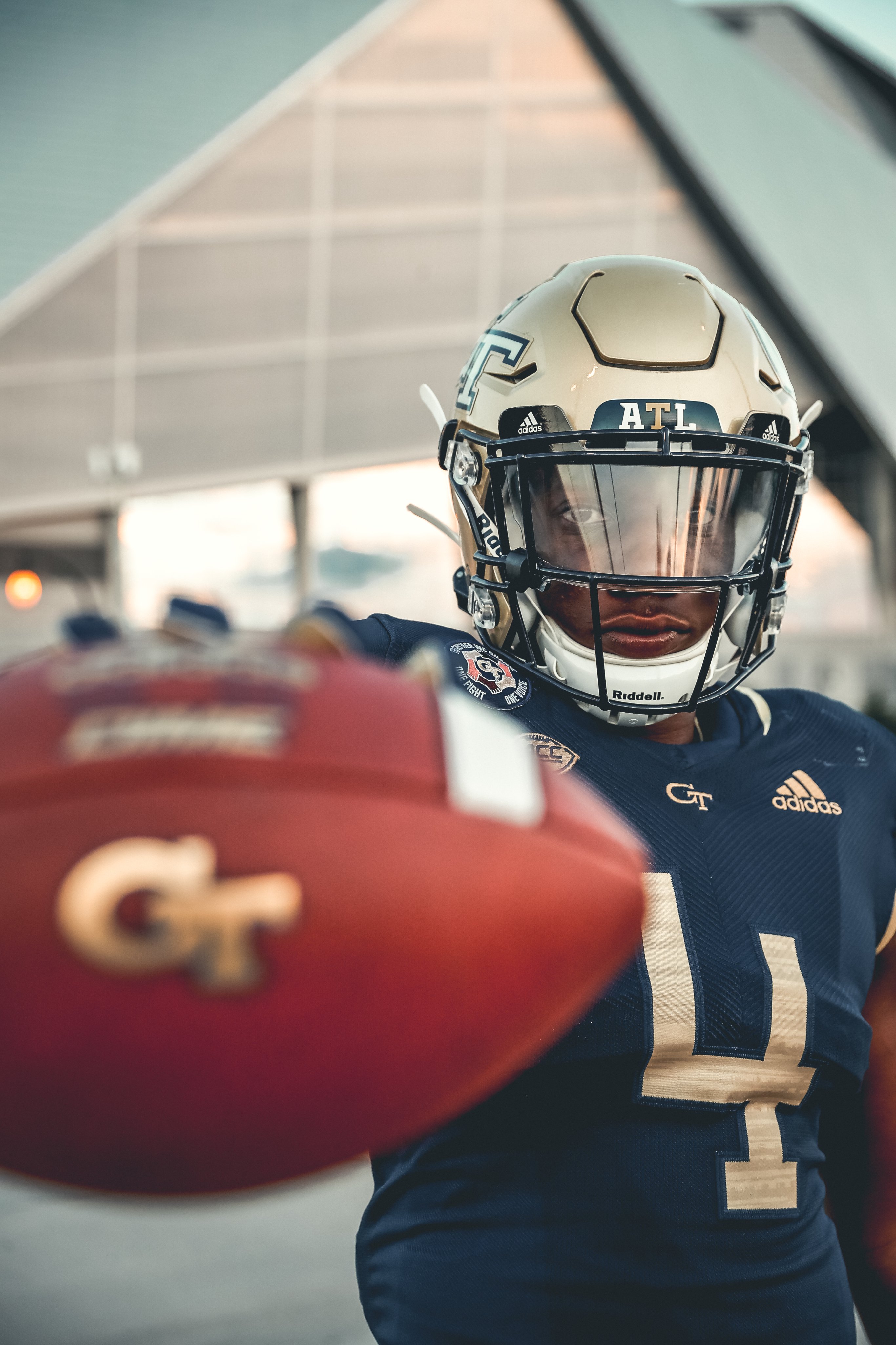
Are those photos from Detroit? I looked again at the video at the top of the thread, and I guess they are the same ugly-azz unis we wore up there. The jerseys look like some cheap jersey you would buy at a thrift store with the numbers just stamped on them. The sewn-on numbers with outlines look MUCH better. The gold numbers stamped on these jerseys might look good if they were sewn on and had a white outline to make them stand out more.
 
My guess is that in College the Visiting Team gets to choose what to wear

Since UNC chose all White that kinda forced our hand into wearing something the 'Croots will luv

Unless we wear the Mustard, Carson-Era throwbacks, then Gold vs the other Team in White doesn't create enough contrast IMO
The gold jerseys O'Leary used would look good too.
 
Are those photos from Detroit? I looked again at the video at the top of the thread, and I guess they are the same ugly-azz unis we wore up there. The jerseys look like some cheap jersey you would buy at a thrift store with the numbers just stamped on them. The sewn-on numbers with outlines look MUCH better. The gold numbers stamped on these jerseys might look good if they were sewn on and had a white outline to make them stand out more.
That a Russell issue, the Official Uniform maker to FCS, DII, and to HS Programs all over America

Yet we kept them around forever, it wasn't the Colors, it was the Company we were in bed with
 
That a Russell issue, the Official Uniform maker to FCS, DII, and to HS Programs all over America

Yet we kept them around forever, it wasn't the Colors, it was the Company we were in bed with
Well, unless there is something different in the ones we wear tomorrow, and it doesn't appear that there is much, if any, then those tomorrow are going to be ugly too. And I don't just mean that because I don't like us wearing blue. Those unis in Detroit were just butt-ugly uniforms.
 
Yes that metallic bright gold was a great jersey, but when the opponent is in all white, that's a tough ask

Except it's not. We were nothing but gold jerseys at home for six straight years not so long ago but I wouldn't expect you to know that.
 
My guess is that in College the Visiting Team gets to choose what to wear

Since UNC chose all White that kinda forced our hand into wearing something the 'Croots will luv

Unless we wear the Mustard, Carson-Era throwbacks, then Gold vs the other Team in White doesn't create enough contrast IMO

IIRC, Home Team absolutely has choice to wear their “dark” home jerseys if they choose to. Visiting team has no say. If home team would like to wear white, they have to get the OK from visiting team.
 
Why are we wearing blue while playing against one of our 3 blue

2-0 actually
NC State 2019, Louisville 2020, Duke 2020. That's 3-0.

EDIT: I meant to say navy jerseys in my OP, not all navy. My bad. We are 2-0 in all Navy.
 
Last edited:
Are those photos from Detroit? I looked again at the video at the top of the thread, and I guess they are the same ugly-azz unis we wore up there. The jerseys look like some cheap jersey you would buy at a thrift store with the numbers just stamped on them. The sewn-on numbers with outlines look MUCH better. The gold numbers stamped on these jerseys might look good if they were sewn on and had a white outline to make them stand out more.
You have got some terrible eyes, man. Those are Adidas primeknit jerseys, the best they make. The numbers are stitched on with a navy stitched outline, not stamped. As a matter of fact, our black watch and our gold jerseys are the lower quality offering from Adidas, not on the primeknit template.
 
IIRC, Home Team absolutely has choice to wear their “dark” home jerseys if they choose to. Visiting team has no say. If home team would like to wear white, they have to get the OK from visiting team.
Yes this is how it works. When we wear our traditional white at home, we have to OK it with the opponent first. So if somebody wants to wear all white, they can make us wear a color at home.
 
You have got some terrible eyes, man. Those are Adidas primeknit jerseys, the best they make. The numbers are stitched on with a navy stitched outline, not stamped. As a matter of fact, our black watch and our gold jerseys are the lower quality offering from Adidas, not on the primeknit template.
And öööö your Michael Jordan jerseys UNC.
 
Vegas gold though. They weren’t a great look.

White shirts, yeller britches, give ‘em hell you sons of bitches. That’s our best and iconic look. Once you leave that, I don’t really care whether it’s gold or blue as long as it doesn’t have goddamned honeycombs or bubble numbers on it.
 
Vegas gold though. They weren’t a great look.

White shirts, yeller britches, give ‘em hell you sons of bitches. That’s our best and iconic look. Once you leave that, I don’t really care whether it’s gold or blue as long as it doesn’t have goddamned honeycombs or bubble numbers on it.
Too many bad memories of blowing bubbles?
 
Too many bad memories of blowing bubbles?
Only that the bubble wrap uniforms are a Top 5 bad uniform of all time across all divisions of play. I couldn’t believe that someone at Russell made those and thought “these look good.” I’m even more shocked that someone at GT didn’t see them pre-production and say “not no, but hell no.”
 
Only that the bubble wrap uniforms are a Top 5 bad uniform of all time across all divisions of play. I couldn’t believe that someone at Russell made those and thought “these look good.” I’m even more shocked that someone at GT didn’t see them pre-production and say “not no, but hell no.”
Actually, Bubbles called me the other night. Says he misses you
 
You have got some terrible eyes, man. Those are Adidas primeknit jerseys, the best they make. The numbers are stitched on with a navy stitched outline, not stamped. As a matter of fact, our black watch and our gold jerseys are the lower quality offering from Adidas, not on the primeknit template.
When even one person says they look like stamped on, that tells me they look like s***, and they do, Even from lower deck sideline seats in Detroit, I couldn't make out half the numbers. WTF would you outline the numbers with the same color of the shirt. Even the white numbers on the gold jerseys need outlines to make the numbers more legible from the stands. That's just plain stupid, I don't care what company makes them or how "premium knit" they are. Other than those hideous blues in Detroit, I still think that Russell gear LOOKS a helluva lot better than Adidas. Not saying it's the same quality, but the look was definitely better. Much of Adidas gear looks like crap to me. And what black watch unis are you talking about?
 
Back
Top