ramblinwise1
beware the zealot
- Joined
- Dec 17, 2001
- Messages
- 18,420
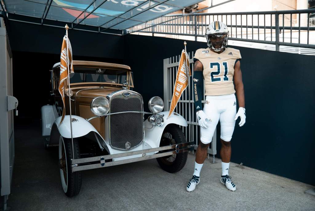
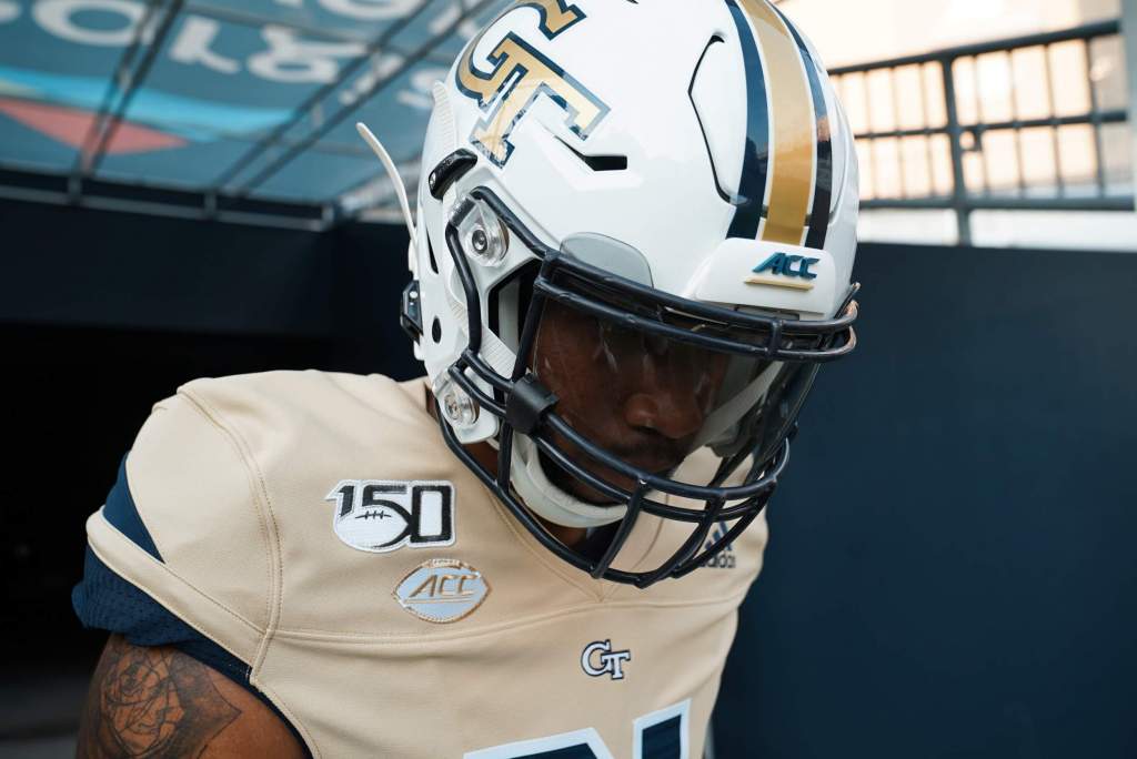
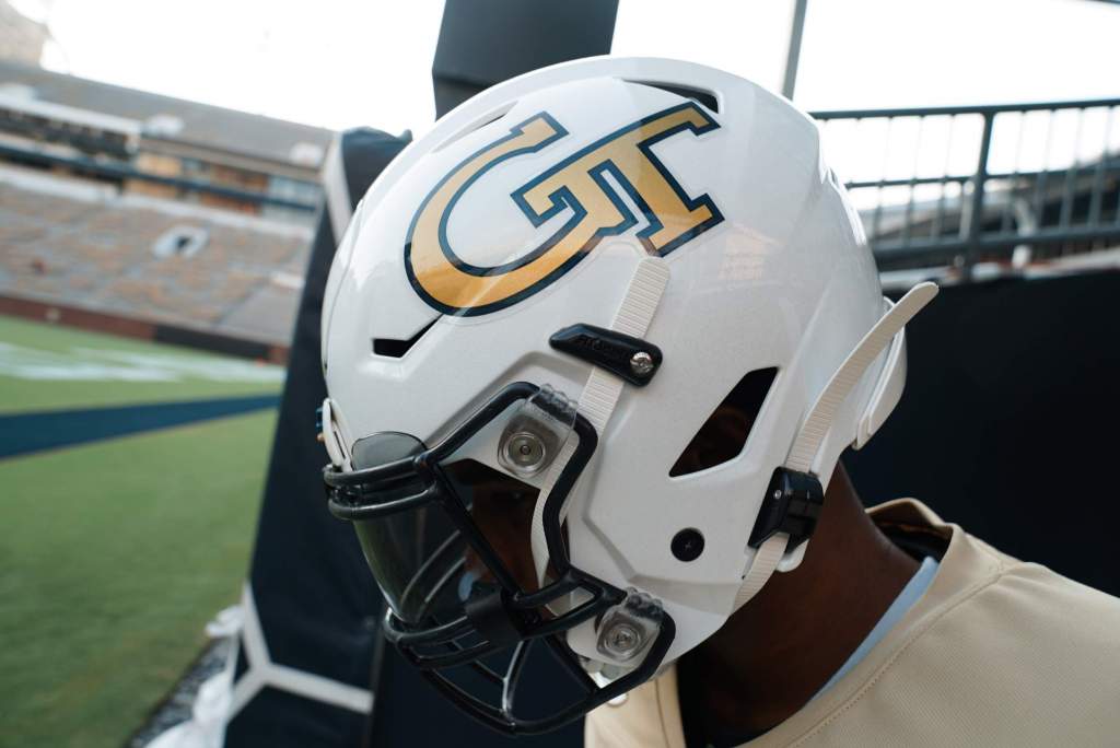
Yep. Back to Chan's piss yellow.I really like this combo. But...I’ll be that guy: the gold on the helmet logo and the gold jersey don’t match for like the 1,000th consecutive time. If you have to nitpick, the gold on the jersey is very, very light. The helmet logo gold is perfect.