- Joined
- Mar 28, 2011
- Messages
- 40,685
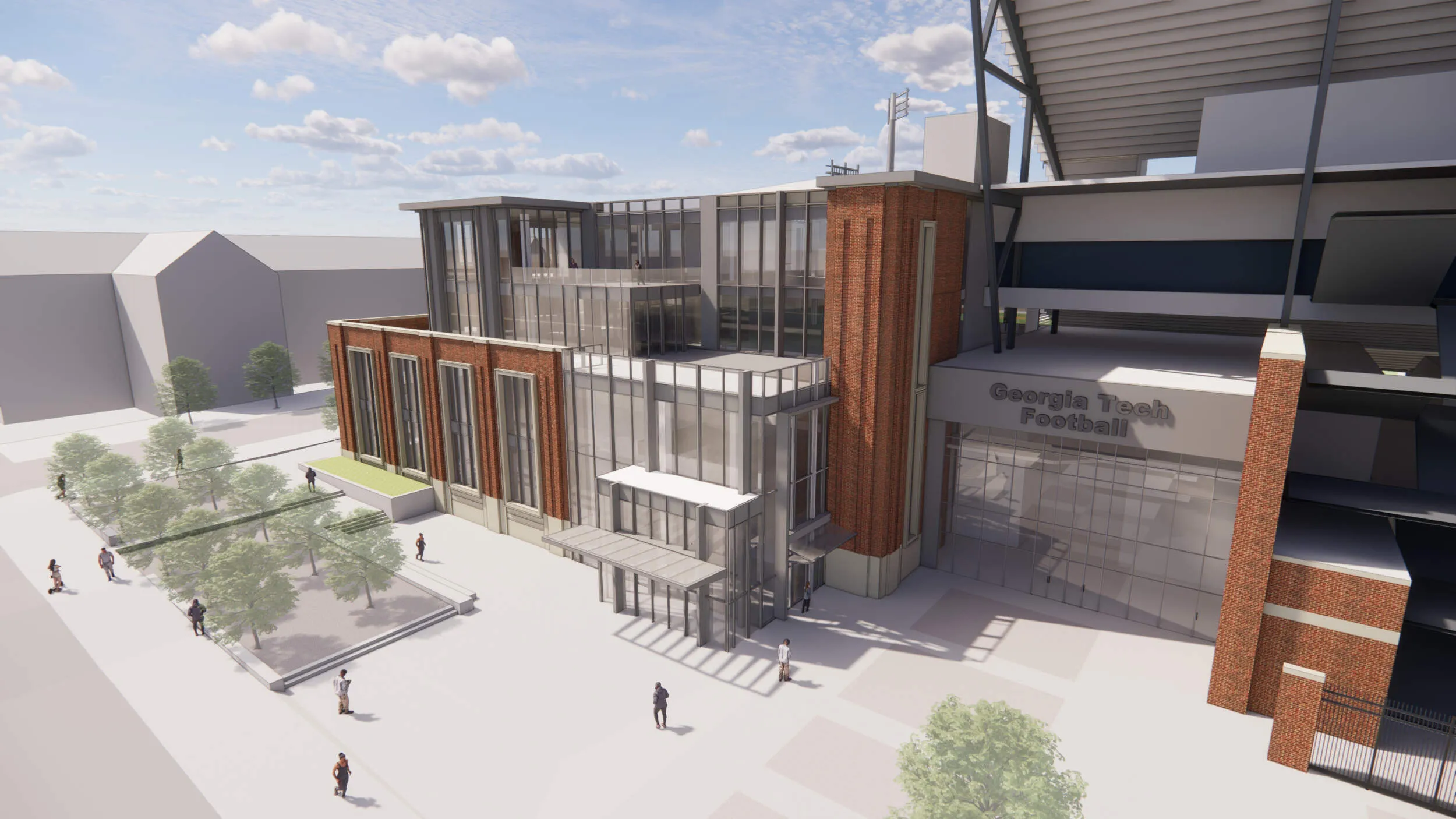
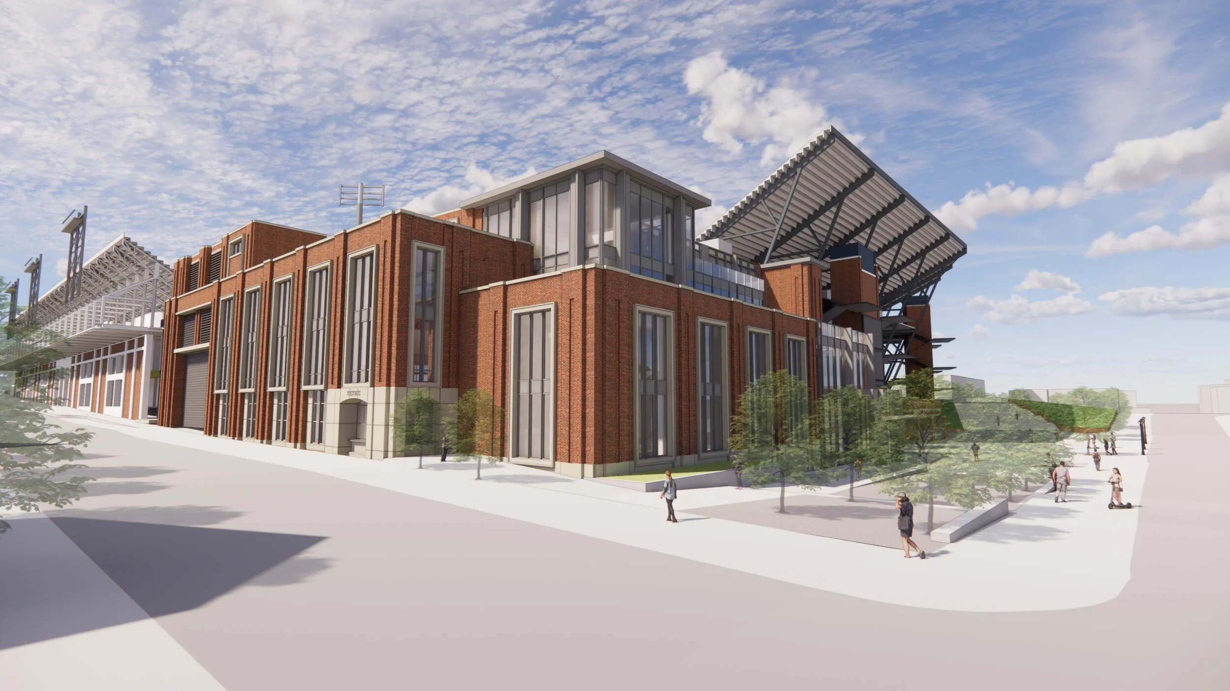
I think this was the latest rendering
Wow we’ve got so many fans in those renderings.
Follow along with the video below to see how to install our site as a web app on your home screen.
Note: This feature may not be available in some browsers.
I think this was the latest rendering
Wow we’ve got so many fans in those renderings.

Touch Hey! We buried Mom last Friday asshole.I usually just park at your mom’s house.
Reminds me to stop by for a cold one sometime.Touch Hey! We buried Mom last Friday asshole.
Touch Hey! We buried Mom last Friday asshole.
There is nothing that can’t be improved by adding more bricks.Moar bricks!
This would please ol' Clyde Robbins; tearing up something and replacing it with almost the same thing except this time with bricks.
Statute of limitations is like 15 minutes.Touch Hey! We buried Mom last Friday asshole.
All the old surrounding buildings do, the brick will help integrate it to the campus, from The Hill to The Flats.Looks nice! Does the stadium already have red brick incorporated?
ThanksI‘m sorry for your loss. And ours.
Overall I think it's a big improvement. The style is much more in line with existing elements, the historical nature of the stadium and the east campus architecture in general.Per J's email today it looks like renderings for the Edge building have been updated (new Student-Athlete Performance Center). They look much improved and more of a timeless design (link to message: https://ramblinwreck.com/from-the-desk-of-j-batt-sept2023/)


Low attendance is fixed by winning, not tearing down parts of the stadiumCan
Overall I think it's a big improvement. The style is much more in line with existing elements, the historical nature of the stadium and the east campus architecture in general.
That said, the entire stadium desperately needs a master plan. It remains a hodgepodge of glued together pieces from different time periods with different design ideas and nothing at all cohesive. At least this design appears to attempt to recognize the problem and make it a bit more uniform than the previous renderings.
The north stands remain a towering eye sore, with generally low attendance and a monument to the poor overall planning of the stadium and related facilities. Bad look for Georgia Tech given that academically it specializes in this sort of thing.
The most obvious question here should be, "what is the future of the entire stadium facility and will this design work in that planned future?".
I haven't heard anything about that plan and the AD/President should at least answer the question about the long term planning of it all.
Not a fan at all. The massing is completely ööööed. It doesn't have to be a glass box, but the treatment of the brick leaves a significant amount to be desired. The glass boxes/massing on the upper floors towards the north lacks any cohesiveness - the flat roof fascia doesn't help. Also, if you're going to use stone to accentuate an entry, make it bigger than some 10x10 entry and don't limit that material to a small corner of the design. I will applaud them for only using 3 materials.
Perhaps you're just full of shit.Perhaps they had to change the design because of the current inflated pricing of everything because of this crappy economy. I know of several projects of acquaintances I know are building commercial wise have had to greatly scale things back because of it.
In the article there is reference to a comprehensive plan underway for the stadium with a focus on more premium seating. Batt was part of the recent renovation at Bryant-Denny so I would think that design could be an indicator of what is in store.Can
Overall I think it's a big improvement. The style is much more in line with existing elements, the historical nature of the stadium and the east campus architecture in general.
That said, the entire stadium desperately needs a master plan. It remains a hodgepodge of glued together pieces from different time periods with different design ideas and nothing at all cohesive. At least this design appears to attempt to recognize the problem and make it a bit more uniform than the previous renderings.
The north stands remain a towering eye sore, with generally low attendance and a monument to the poor overall planning of the stadium and related facilities. Bad look for Georgia Tech given that academically it specializes in this sort of thing.
The most obvious question here should be, "what is the future of the entire stadium facility and will this design work in that planned future?".
I haven't heard anything about that plan and the AD/President should at least answer the question about the long term planning of it all.
Perhaps you're just full of öööö.
Touch Hey! We buried Mom last Friday asshole.
