Install the app
How to install the app on iOS
Follow along with the video below to see how to install our site as a web app on your home screen.
Note: This feature may not be available in some browsers.
You are using an out of date browser. It may not display this or other websites correctly.
You should upgrade or use an alternative browser.
You should upgrade or use an alternative browser.
New uniforms incoming
- Thread starter murrayjacket
- Start date
With his name in bold.He probably got hooked onto the line from press release from the school mentioning Collins having input into the design.
andrew
Bobby Bonilla's Financial Planner
- Joined
- Jun 5, 2010
- Messages
- 28,196
He could be trolling but there are some out there that will find anything at all to bitch about (and use it to bash CGC if possible). Hell he could have organized a huge fundraising drive this offseason that generated $500M for the program and there are folks out there that would bitch because he spent too much time on that.
There are but pretty much every post by this guy is inflammatory. And even this language one uses language that feels like it's more designed to get a rise out of people than just to gripe about Collins.
ElCidBUZZingFAN
Dodd-Like
- Joined
- Nov 1, 2006
- Messages
- 25,604
I'm only answering the question - where is that dude getting that Collins designs uniforms.With his name in bold.
The critique he spent any time on this is dumb. His involvement could have merely been shown the 389 versions of uniforms over the years and been asked a question - which one/era should be used as a template - he answers early to mid-90s....and that was it.
The pallet of uniforms, colors, designs, themes, and shit in the past 10 years even is pretty wild.

Georgia Tech's uniform evolution
Over the last two decades, Georgia Tech's uniforms have had a radical transformation.
DaDodd
Varsity Lurker
- Joined
- Feb 23, 2016
- Messages
- 105
Thank you Tech for actually listen to the fans and bringing back the classic look. But just like everything Tech does, they still can't seem to get it 100% correct. I get that this is nitpicky and I am really happy with the change, but it always seems like Tech will get so close to perfection then throw in weird things to make it not prefect. They were so close but here are a few things that still frustrate me about these new uniforms. And yes these are very nitpicky. I get it.
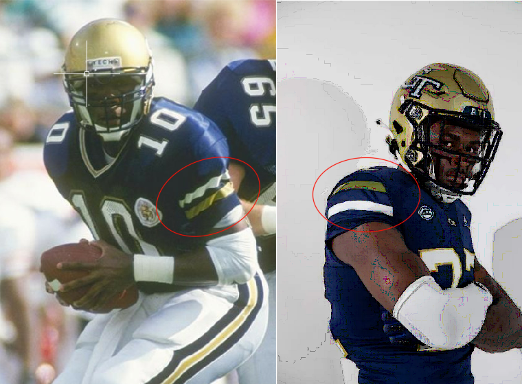
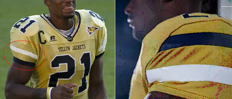
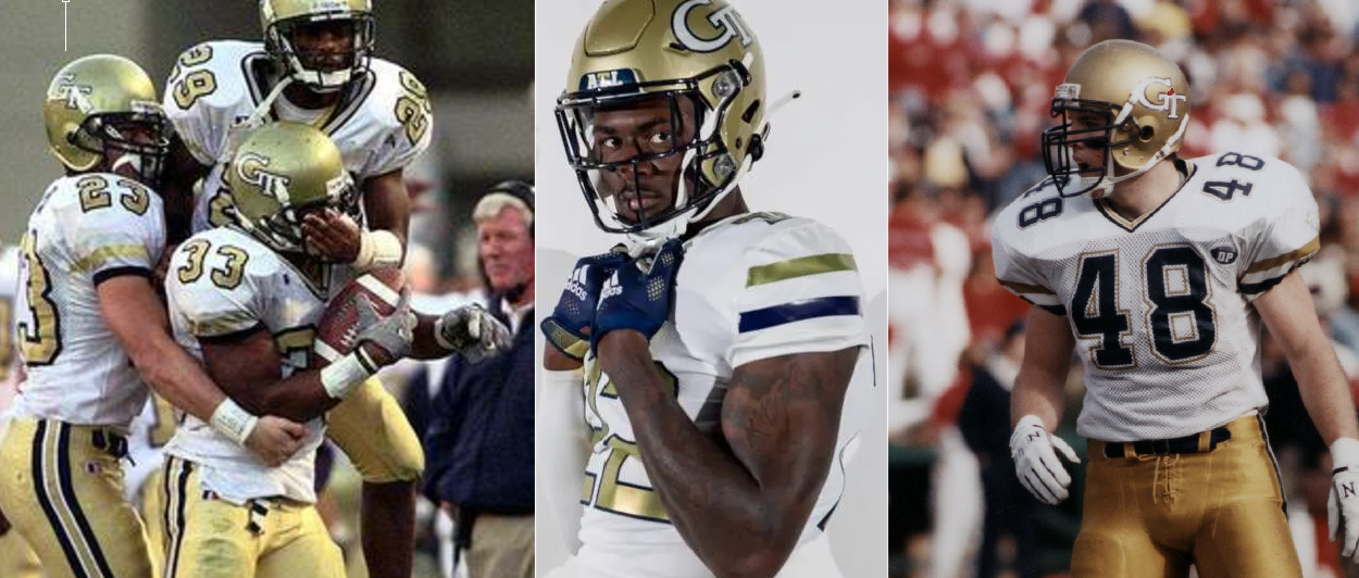
First is the shoulder stripe order. You can see that on the traditional navy jersey has the gold stripe is on the bottom and white on top. Same with the traditional gold uniform. Navy stripe on bottom and white on top. Why did they switch these? They were so close. At least they got the white jerseys correct with navy on bottom and gold on top. I do appreciate the return the white numbers on the navy jerseys. The gold numbers on the white jersey don't bother me to much, although traditionally we had navy numbers on the white jerseys. Gold numbers on white uniforms were only used from 1998 to 2002. White numbers on gold jerseys were only worn a few times from 1998 to 2002.
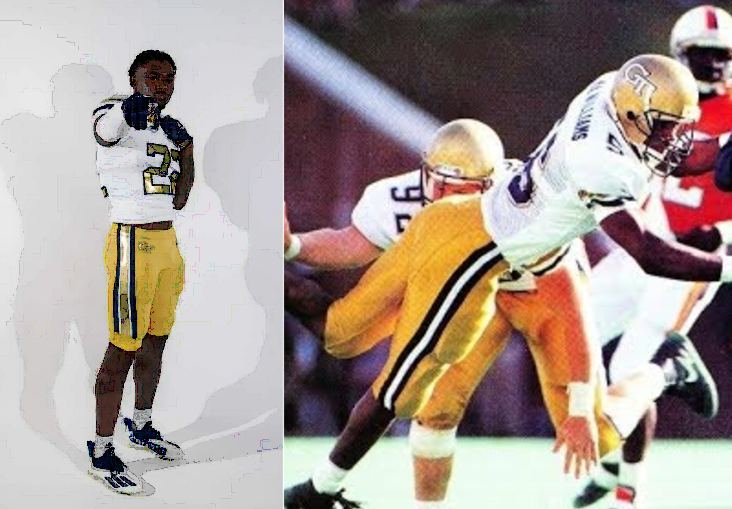
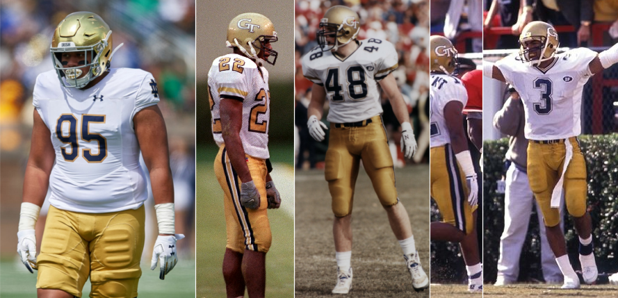
Second is the stipes on the gold pants. I get that from around 1992 until 2007 the stripe pattern was navy, thin white, gold, thin white, navy. Which was the same on the white pants since the 1980s. but traditionally since the 1950s the old pants stipes were just navy, white, navy. And I think that's just a cleaner look. I'm ok with the white pants being navy, thin white, gold, thin white, navy, but removing the thin white stripes within would be cleaner look. Also, the fact that the stripes do not go all the way down the pants is just some of the stupid things I'm talking about with Tech's execution of things. They can never seem to get it just right. I know someone earlier said that the Russell uniform template from 2016-2017 were just about perfect and I would have to agree.
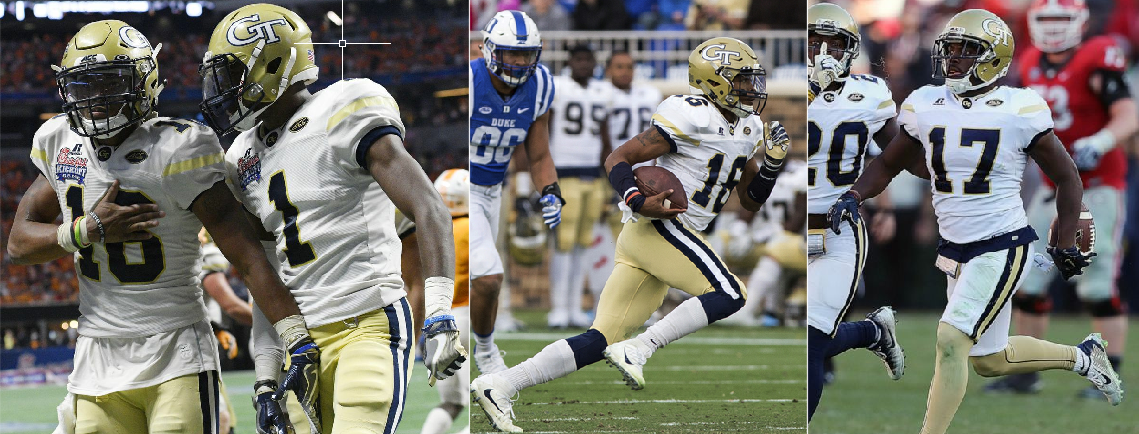
Lastly is the uses of the two different golds. While the metallic gold does pop, it clashes with the mustered gold pants. I agree that the vegas gold from the Russell uniforms were to dull and I think the gold used on the pants from the 1950s until around 1991 is the correct shade of gold. Notre Dame's gold pants today are the correct shade we should be aiming for. It's every close to what we use to wear. Also, in 2018 our helmets wear changed to a lighter shade of gold. I think the helmets from 2016-2017 were the correct shade of gold. We do not need our helmets to match the mustered gold pants like they did in 2008. I think ditch the metallic and find a good middle ground between the golds of the helmet and the rest of the uniform like we did from the 1950s until 1991.

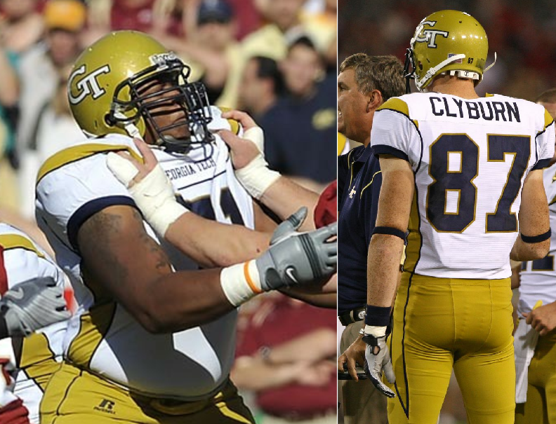
I know I'm going to get gripe about being nitpicky but my point is show that Tech can never really get anything 100% right. I know you can't always get everything 100% right all the time but when it comes to something as easy as this and you still can't execute it correctly; it's just sad. It isn't that hard to do a quick google search to see what Tech wore traditionally and then replicate it.
Overall I am happy with the focus on tradition, I'm just upset with the execution. Lets just hope they standardize when they wear which uniform. If it were up to me we would were GWG for home and away games. GGW for homecoming and against UGA at home. WWW or GWW for one whiteout game. and GBW for one special home game. Keep it simple so that the players aren't focused on which uniform they are going to where that week so they can be focused on the game. The fans will know what to expect. No more gimmicky weekly uniform reveals. The top teams in the country don't do any of that. They keep it simple so that they can focus of the game.
First is the shoulder stripe order. You can see that on the traditional navy jersey has the gold stripe is on the bottom and white on top. Same with the traditional gold uniform. Navy stripe on bottom and white on top. Why did they switch these? They were so close. At least they got the white jerseys correct with navy on bottom and gold on top. I do appreciate the return the white numbers on the navy jerseys. The gold numbers on the white jersey don't bother me to much, although traditionally we had navy numbers on the white jerseys. Gold numbers on white uniforms were only used from 1998 to 2002. White numbers on gold jerseys were only worn a few times from 1998 to 2002.
Second is the stipes on the gold pants. I get that from around 1992 until 2007 the stripe pattern was navy, thin white, gold, thin white, navy. Which was the same on the white pants since the 1980s. but traditionally since the 1950s the old pants stipes were just navy, white, navy. And I think that's just a cleaner look. I'm ok with the white pants being navy, thin white, gold, thin white, navy, but removing the thin white stripes within would be cleaner look. Also, the fact that the stripes do not go all the way down the pants is just some of the stupid things I'm talking about with Tech's execution of things. They can never seem to get it just right. I know someone earlier said that the Russell uniform template from 2016-2017 were just about perfect and I would have to agree.
Lastly is the uses of the two different golds. While the metallic gold does pop, it clashes with the mustered gold pants. I agree that the vegas gold from the Russell uniforms were to dull and I think the gold used on the pants from the 1950s until around 1991 is the correct shade of gold. Notre Dame's gold pants today are the correct shade we should be aiming for. It's every close to what we use to wear. Also, in 2018 our helmets wear changed to a lighter shade of gold. I think the helmets from 2016-2017 were the correct shade of gold. We do not need our helmets to match the mustered gold pants like they did in 2008. I think ditch the metallic and find a good middle ground between the golds of the helmet and the rest of the uniform like we did from the 1950s until 1991.
I know I'm going to get gripe about being nitpicky but my point is show that Tech can never really get anything 100% right. I know you can't always get everything 100% right all the time but when it comes to something as easy as this and you still can't execute it correctly; it's just sad. It isn't that hard to do a quick google search to see what Tech wore traditionally and then replicate it.
Overall I am happy with the focus on tradition, I'm just upset with the execution. Lets just hope they standardize when they wear which uniform. If it were up to me we would were GWG for home and away games. GGW for homecoming and against UGA at home. WWW or GWW for one whiteout game. and GBW for one special home game. Keep it simple so that the players aren't focused on which uniform they are going to where that week so they can be focused on the game. The fans will know what to expect. No more gimmicky weekly uniform reveals. The top teams in the country don't do any of that. They keep it simple so that they can focus of the game.
Supersize that order mutt
Dodd-Like
- Joined
- Mar 26, 2013
- Messages
- 5,124
This makes a helluva lot of sense. Sadly I think good sense is missing in our athletics departmentOverall I am happy with the focus on tradition, I'm just upset with the execution. Lets just hope they standardize when they wear which uniform. If it were up to me we would were GWG for home and away games. GGW for homecoming and against UGA at home. WWW or GWW for one whiteout game. and GBW for one special home game. Keep it simple so that the players aren't focused on which uniform they are going to where that week so they can be focused on the game. The fans will know what to expect. No more gimmicky weekly uniform reveals. The top teams in the country don't do any of that. They keep it simple so that they can focus of the game.
I'm only answering the question - where is that dude getting that Collins designs uniforms.
The critique he spent any time on this is dumb. His involvement could have merely been shown the 389 versions of uniforms over the years and been asked a question - which one/era should be used as a template - he answers early to mid-90s....and that was it.
The pallet of uniforms, colors, designs, themes, and öööö in the past 10 years even is pretty wild.

Georgia Tech's uniform evolution
Over the last two decades, Georgia Tech's uniforms have had a radical transformation.www.ajc.com
Link here - https://ramblinwreck.com/tech-football-unveils-new-uniforms-2022/
Screenshot here:
To me it makes no sense to put his name in the press release and why on earth did they bold his name? It's the only text that was bolded that is not a link.
MidnightJacket
Damn Good Rat
- Joined
- Mar 12, 2008
- Messages
- 1,328
Link here - https://ramblinwreck.com/tech-football-unveils-new-uniforms-2022/
Screenshot here:

To me it makes no sense to put his name in the press release and why on earth did they bold his name? It's the only text that was bolded that is not a link.
Honest question, what difference does it make whether they listed him in the article or bolded his name?
MidnightJacket
Damn Good Rat
- Joined
- Mar 12, 2008
- Messages
- 1,328
Thank you Tech for actually listen to the fans and bringing back the classic look. But just like everything Tech does, they still can't seem to get it 100% correct. I get that this is nitpicky and I am really happy with the change, but it always seems like Tech will get so close to perfection then throw in weird things to make it not prefect. They were so close but here are a few things that still frustrate me about these new uniforms. And yes these are very nitpicky. I get it.
First is the shoulder stripe order. You can see that on the traditional navy jersey has the gold stripe is on the bottom and white on top. Same with the traditional gold uniform. Navy stripe on bottom and white on top. Why did they switch these? They were so close. At least they got the white jerseys correct with navy on bottom and gold on top. I do appreciate the return the white numbers on the navy jerseys. The gold numbers on the white jersey don't bother me to much, although traditionally we had navy numbers on the white jerseys. Gold numbers on white uniforms were only used from 1998 to 2002. White numbers on gold jerseys were only worn a few times from 1998 to 2002.


Second is the stipes on the gold pants. I get that from around 1992 until 2007 the stripe pattern was navy, thin white, gold, thin white, navy. Which was the same on the white pants since the 1980s. but traditionally since the 1950s the old pants stipes were just navy, white, navy. And I think that's just a cleaner look. I'm ok with the white pants being navy, thin white, gold, thin white, navy, but removing the thin white stripes within would be cleaner look. Also, the fact that the stripes do not go all the way down the pants is just some of the stupid things I'm talking about with Tech's execution of things. They can never seem to get it just right. I know someone earlier said that the Russell uniform template from 2016-2017 were just about perfect and I would have to agree.


Lastly is the uses of the two different golds. While the metallic gold does pop, it clashes with the mustered gold pants. I agree that the vegas gold from the Russell uniforms were to dull and I think the gold used on the pants from the 1950s until around 1991 is the correct shade of gold. Notre Dame's gold pants today are the correct shade we should be aiming for. It's every close to what we use to wear. Also, in 2018 our helmets wear changed to a lighter shade of gold. I think the helmets from 2016-2017 were the correct shade of gold. We do not need our helmets to match the mustered gold pants like they did in 2008. I think ditch the metallic and find a good middle ground between the golds of the helmet and the rest of the uniform like we did from the 1950s until 1991.


I know I'm going to get gripe about being nitpicky but my point is show that Tech can never really get anything 100% right. I know you can't always get everything 100% right all the time but when it comes to something as easy as this and you still can't execute it correctly; it's just sad. It isn't that hard to do a quick google search to see what Tech wore traditionally and then replicate it.
Overall I am happy with the focus on tradition, I'm just upset with the execution. Lets just hope they standardize when they wear which uniform. If it were up to me we would were GWG for home and away games. GGW for homecoming and against UGA at home. WWW or GWW for one whiteout game. and GBW for one special home game. Keep it simple so that the players aren't focused on which uniform they are going to where that week so they can be focused on the game. The fans will know what to expect. No more gimmicky weekly uniform reveals. The top teams in the country don't do any of that. They keep it simple so that they can focus of the game.
This is the most nitpicky shit I've ever seen in a uniform thread. Cutting into the nits tho, I'll say that the color placement on the shoulder stripes looks better than the counterparts you showed in the pictures, but could just be quality of the colors/fabrics of the new jerseys.
Thanks for sharing the old pictures, it makes me happy that we're not using vegas gold anymore. That color was awful.
The Jacket
The Coat
- Joined
- Jun 17, 2002
- Messages
- 33,567
You are my hero.Thank you Tech for actually listen to the fans and bringing back the classic look. But just like everything Tech does, they still can't seem to get it 100% correct. I get that this is nitpicky and I am really happy with the change, but it always seems like Tech will get so close to perfection then throw in weird things to make it not prefect. They were so close but here are a few things that still frustrate me about these new uniforms. And yes these are very nitpicky. I get it.
First is the shoulder stripe order. You can see that on the traditional navy jersey has the gold stripe is on the bottom and white on top. Same with the traditional gold uniform. Navy stripe on bottom and white on top. Why did they switch these? They were so close. At least they got the white jerseys correct with navy on bottom and gold on top. I do appreciate the return the white numbers on the navy jerseys. The gold numbers on the white jersey don't bother me to much, although traditionally we had navy numbers on the white jerseys. Gold numbers on white uniforms were only used from 1998 to 2002. White numbers on gold jerseys were only worn a few times from 1998 to 2002.


Second is the stipes on the gold pants. I get that from around 1992 until 2007 the stripe pattern was navy, thin white, gold, thin white, navy. Which was the same on the white pants since the 1980s. but traditionally since the 1950s the old pants stipes were just navy, white, navy. And I think that's just a cleaner look. I'm ok with the white pants being navy, thin white, gold, thin white, navy, but removing the thin white stripes within would be cleaner look. Also, the fact that the stripes do not go all the way down the pants is just some of the stupid things I'm talking about with Tech's execution of things. They can never seem to get it just right. I know someone earlier said that the Russell uniform template from 2016-2017 were just about perfect and I would have to agree.


Lastly is the uses of the two different golds. While the metallic gold does pop, it clashes with the mustered gold pants. I agree that the vegas gold from the Russell uniforms were to dull and I think the gold used on the pants from the 1950s until around 1991 is the correct shade of gold. Notre Dame's gold pants today are the correct shade we should be aiming for. It's every close to what we use to wear. Also, in 2018 our helmets wear changed to a lighter shade of gold. I think the helmets from 2016-2017 were the correct shade of gold. We do not need our helmets to match the mustered gold pants like they did in 2008. I think ditch the metallic and find a good middle ground between the golds of the helmet and the rest of the uniform like we did from the 1950s until 1991.


I know I'm going to get gripe about being nitpicky but my point is show that Tech can never really get anything 100% right. I know you can't always get everything 100% right all the time but when it comes to something as easy as this and you still can't execute it correctly; it's just sad. It isn't that hard to do a quick google search to see what Tech wore traditionally and then replicate it.
Overall I am happy with the focus on tradition, I'm just upset with the execution. Lets just hope they standardize when they wear which uniform. If it were up to me we would were GWG for home and away games. GGW for homecoming and against UGA at home. WWW or GWW for one whiteout game. and GBW for one special home game. Keep it simple so that the players aren't focused on which uniform they are going to where that week so they can be focused on the game. The fans will know what to expect. No more gimmicky weekly uniform reveals. The top teams in the country don't do any of that. They keep it simple so that they can focus of the game.
Buzz_404
Varsity Lurker
- Joined
- Jul 11, 2022
- Messages
- 110
Don’t wear white at home, it’s boringThank you Tech for actually listen to the fans and bringing back the classic look. But just like everything Tech does, they still can't seem to get it 100% correct. I get that this is nitpicky and I am really happy with the change, but it always seems like Tech will get so close to perfection then throw in weird things to make it not prefect. They were so close but here are a few things that still frustrate me about these new uniforms. And yes these are very nitpicky. I get it.
First is the shoulder stripe order. You can see that on the traditional navy jersey has the gold stripe is on the bottom and white on top. Same with the traditional gold uniform. Navy stripe on bottom and white on top. Why did they switch these? They were so close. At least they got the white jerseys correct with navy on bottom and gold on top. I do appreciate the return the white numbers on the navy jerseys. The gold numbers on the white jersey don't bother me to much, although traditionally we had navy numbers on the white jerseys. Gold numbers on white uniforms were only used from 1998 to 2002. White numbers on gold jerseys were only worn a few times from 1998 to 2002.


Second is the stipes on the gold pants. I get that from around 1992 until 2007 the stripe pattern was navy, thin white, gold, thin white, navy. Which was the same on the white pants since the 1980s. but traditionally since the 1950s the old pants stipes were just navy, white, navy. And I think that's just a cleaner look. I'm ok with the white pants being navy, thin white, gold, thin white, navy, but removing the thin white stripes within would be cleaner look. Also, the fact that the stripes do not go all the way down the pants is just some of the stupid things I'm talking about with Tech's execution of things. They can never seem to get it just right. I know someone earlier said that the Russell uniform template from 2016-2017 were just about perfect and I would have to agree.


Lastly is the uses of the two different golds. While the metallic gold does pop, it clashes with the mustered gold pants. I agree that the vegas gold from the Russell uniforms were to dull and I think the gold used on the pants from the 1950s until around 1991 is the correct shade of gold. Notre Dame's gold pants today are the correct shade we should be aiming for. It's every close to what we use to wear. Also, in 2018 our helmets wear changed to a lighter shade of gold. I think the helmets from 2016-2017 were the correct shade of gold. We do not need our helmets to match the mustered gold pants like they did in 2008. I think ditch the metallic and find a good middle ground between the golds of the helmet and the rest of the uniform like we did from the 1950s until 1991.


I know I'm going to get gripe about being nitpicky but my point is show that Tech can never really get anything 100% right. I know you can't always get everything 100% right all the time but when it comes to something as easy as this and you still can't execute it correctly; it's just sad. It isn't that hard to do a quick google search to see what Tech wore traditionally and then replicate it.
Overall I am happy with the focus on tradition, I'm just upset with the execution. Lets just hope they standardize when they wear which uniform. If it were up to me we would were GWG for home and away games. GGW for homecoming and against UGA at home. WWW or GWW for one whiteout game. and GBW for one special home game. Keep it simple so that the players aren't focused on which uniform they are going to where that week so they can be focused on the game. The fans will know what to expect. No more gimmicky weekly uniform reveals. The top teams in the country don't do any of that. They keep it simple so that they can focus of the game.
OmnipoTech
Jolly Good Fellow
- Joined
- Nov 24, 2013
- Messages
- 1,778
@BeeStorm When did stingtalk start allowing actual children on the site?Don’t wear white at home, it’s boring
I tend to prefer not allowing visiting teams to wear their home colors in our stadium.It is boring, that’s just my opinion, I understand that it is traditional but the blue and gold is too perfect to only wear a couple times a year
DaltonJacket
The Keeper of Souls
- Joined
- Oct 16, 2005
- Messages
- 477
This has always been my preference as well.I tend to prefer not allowing visiting teams to wear their home colors in our stadium.
vapspwi
Dodd-Like
- Joined
- Oct 18, 2002
- Messages
- 8,655
Thank you Tech for actually listen to the fans and bringing back the classic look. But just like everything Tech does, they still can't seem to get it 100% correct. I get that this is nitpicky and I am really happy with the change, but it always seems like Tech will get so close to perfection then throw in weird things to make it not prefect. They were so close but here are a few things that still frustrate me about these new uniforms. And yes these are very nitpicky. I get it.
First is the shoulder stripe order. You can see that on the traditional navy jersey has the gold stripe is on the bottom and white on top. Same with the traditional gold uniform. Navy stripe on bottom and white on top. Why did they switch these? They were so close. At least they got the white jerseys correct with navy on bottom and gold on top. I do appreciate the return the white numbers on the navy jerseys. The gold numbers on the white jersey don't bother me to much, although traditionally we had navy numbers on the white jerseys. Gold numbers on white uniforms were only used from 1998 to 2002. White numbers on gold jerseys were only worn a few times from 1998 to 2002.


Second is the stipes on the gold pants. I get that from around 1992 until 2007 the stripe pattern was navy, thin white, gold, thin white, navy. Which was the same on the white pants since the 1980s. but traditionally since the 1950s the old pants stipes were just navy, white, navy. And I think that's just a cleaner look. I'm ok with the white pants being navy, thin white, gold, thin white, navy, but removing the thin white stripes within would be cleaner look. Also, the fact that the stripes do not go all the way down the pants is just some of the stupid things I'm talking about with Tech's execution of things. They can never seem to get it just right. I know someone earlier said that the Russell uniform template from 2016-2017 were just about perfect and I would have to agree.


Lastly is the uses of the two different golds. While the metallic gold does pop, it clashes with the mustered gold pants. I agree that the vegas gold from the Russell uniforms were to dull and I think the gold used on the pants from the 1950s until around 1991 is the correct shade of gold. Notre Dame's gold pants today are the correct shade we should be aiming for. It's every close to what we use to wear. Also, in 2018 our helmets wear changed to a lighter shade of gold. I think the helmets from 2016-2017 were the correct shade of gold. We do not need our helmets to match the mustered gold pants like they did in 2008. I think ditch the metallic and find a good middle ground between the golds of the helmet and the rest of the uniform like we did from the 1950s until 1991.


I know I'm going to get gripe about being nitpicky but my point is show that Tech can never really get anything 100% right. I know you can't always get everything 100% right all the time but when it comes to something as easy as this and you still can't execute it correctly; it's just sad. It isn't that hard to do a quick google search to see what Tech wore traditionally and then replicate it.
Overall I am happy with the focus on tradition, I'm just upset with the execution. Lets just hope they standardize when they wear which uniform. If it were up to me we would were GWG for home and away games. GGW for homecoming and against UGA at home. WWW or GWW for one whiteout game. and GBW for one special home game. Keep it simple so that the players aren't focused on which uniform they are going to where that week so they can be focused on the game. The fans will know what to expect. No more gimmicky weekly uniform reveals. The top teams in the country don't do any of that. They keep it simple so that they can focus of the game.
I’m broadly traditonalist, in that I like it when we have good looking white and gold jerseys and pants and maybe use navy sparingly. But there’s no “tradition” bound up in the order of the stripes on the shoulders.
The goal here should be to make a relatively modern jersey with broad nods to tradition, not to make a throwback replica jersey. We’ve got way too many uniform autists in our fanbase that won’t be satisfied if we don’t have the right number of holes in our mesh jerseys.
JRjr
vapspwi
Dodd-Like
- Joined
- Oct 18, 2002
- Messages
- 8,655
Don’t wear white at home, it’s boring
What it is is something approaching an identity, something that makes us unique and memorable. We’re sorely lacking any identity besides “that 3O team that’s turned into a doormat.” Not many schools (us and LSU, IIRC) choose to wear white at home.
I’m not gonna be pissed if we don’t wear white every game (but I will be pissed if we come out in navy on navy again), but it’s something interesting and unique that we should try to capitalize on. It’s better than “money down” and “drip walks” and whatever else Coach Tryhard has come up with.
JRjr
I looked at that and now I have an erection that won’t go awayThat last one - the ‘90 MNC uniform - is atomic.
My God. That’s beautiful.
Buzz_404
Varsity Lurker
- Joined
- Jul 11, 2022
- Messages
- 110
I hate that too, hate seeing our seniors come out of the tunnel to an all red houseI tend to prefer not allowing visiting teams to wear their home colors in our stadium.
wesgt123
Varsity Lurker
- Joined
- Jul 15, 2019
- Messages
- 230
That’s me pretty much any time I go in there. Either that or my broke ass can’t afford a $90 hoodie or $100 jersey lolThis is also my opnion. Where the heck is the bling for the fans or for Fanatics.com?
I made the agonizingly long trip to BDS last year for the VT game and spent over an hour in the GT Bookstore to buy some GT stuff for wife and daughter. I even saw Sinjin Days in the store so figured it was my lucky day.
It wasn’t.
I left the store without buying anything. Everything they had sucked. I went home empty-handed.
Share:
